Sunday, 30 October 2011

Photoshop Landscape 1

Figure 1.

Figure 2.

Figure 3.

Figure 4.

Figure 5.

Figure 6.


A quick unfinished idea for The Fall of The House of Usher. Step by step process of a Landscape depicting the House of Usher in the foreground with some mountains and clouds in the background.

Unit 2. Space.


For my unit 2 brief I have been assigned 
The Fall of the House of Usher (1839) 
and
The Pit and the Pendulum (1842)
by Edgar Allan Poe.

Both books are rich in descriptive language and gothic subtexts.
A wonderful opportunity to exercise my artistic liscence.

Thursday, 20 October 2011

Unit 1. Anatomy Presentation

Unit 1. Anatomy Crit Presentation

Stylistic Lighting


Early Morning Light


Mid Day Light


Midnight Light


Horror Light


Sci-Fi Light

Two and Three Point Lighting


Two Point Lighting


Three Point Lighting

Hand Concept


Half Turnaround of an idea I had for the hands of my hybrid, incorporating human opposable thumbs and the other two digits but still with the main focus on the hooves which are the middle and ring fingers.

Hand and Foot Studies


One Point Lighting Rear


I love this one.

One point Lighting Front

Magnifying Glass

Photoshopping


Tonal Giraffe Hybrid Concepts

Quick Thumbnails


These two pages of thumbnail I actually did way back at the begining of the second week but I wasn't sure how to upload them to the blog and then they seem to have been left behind a little.

Thursday, 13 October 2011


                  Figure 1.           (Two minute sketches, pencil)          Figure 2.


          Figure 3.      (25 minute sketches, pencil and charcoal)      Figure 4.
                                      

                                           Figure 5.  (30 minutes, charcoal)

I enjoyed the warm-up exercises (see Figures 1 & 2) which consisted of about eleven 2 minute sketches. these really helped me to get back into the flow of drawing after a weeks break. Figures 3 & 4 are focusing mainly on proportion and I can definitely see an improvement from the first few weeks of life drawing. We had a model change after this and Figure 5 is also more about proportion than tone or weight of lines but I was still able to chuck some in there. I know the head is a bit small but the models head was actually quite small in comparison to her body (no offence intended).

Wednesday, 12 October 2011

Maya Work

Maya Pen

I finally got my head round Maya. It took me a while but this is the resulting product. I chose the blue-green colour as I used to have a pen like this one and it was this colour.

Influence Map


A mixture of Animation, Concept, Fancy dress and Mythology.

Monday, 10 October 2011

Film Review: The Fly (1986)

The Fly 1986

Thursday, 6 October 2011

Preliminary Thumbnails

Just some initial ideas. I like numbers 2 & 4 but it would be great to get some feedback. if you see something you like or you have any suggestions please comment.

     This one was just a bit of fun really. I was going for a David Cronenberg approach with this, crawling across the floor, possibly fresh out the telepod, but it just doesn't seem to fit with what I'm going for.

Wednesday, 5 October 2011

Life Drawing with Charcoal


                      Figure 1.                                                                         Figure 2.


I'm not used to using charcoal, I try and avoid it if I can as it is rather messy and I never have any hairspray, but I really enjoyed this figure study session. In terms of drawing, the rubber was just as Important as the charcoal to help create the form and lighting. Although it took me a little while to build up the confidence to change my picturewhen it was required. I think of drawing in charcoal to be a similar experience to drawing in Photoshop.

Monday, 3 October 2011

Head Studies


                Figure 1.                         Figure 2.                             Figure 3.


 Some profile sketches of me and my animal. The picture of the Giraffe I took from the internet and the two of me were accomplished with a complex series of mirrors I hooked up in my room as My webcam's stopped working... spending so much time looking at myself I have come to the very groundbraking and shocking conclusion .....that I could probaly do with a shave.

Skull Studies

 Figure 1. Giraffe Skull


Figure 2. Human Skull

The Giraffe has a truly Fantastic skull already and I'm almost reluctant to alter it in any way but the posibilities the creature holds are just too exciting. I think the horns are a must for my hybridization along with the nasal ridge as they are a major defining feature on the Giraffes head, also the wide set eyes as they conjure up an almost melancholic demeanour which I think will help me greatly as I try to tread the imperfect path of humanity.

However the feature that grasps a large portion of my focus is simply this, the Giraffe has no front teeth on it's upper jaw. I really want to incorporate this into my own face purely because I think it'll be hilarious but trying to avoid the trap of humour will be a tough one.

Hand and Foot Studies

 Figure 1. Foot Study

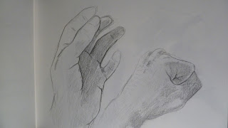
Figure 2. Hand Study

Just a couple of sketches here trying to get down the shape/makeup of some of the key parts of the anatomy that I'd like to focus on. Giraffes evolved over hundreds of millions of years into cloven hoofed animals, gradually evolving from walking on five digit feet to only walking on two digits, the remaing three fingers reducing in size to now being almost non existant. On a human these two fingers would be the middle and ring finger. I'm hoping to upload some sketches of Giraffe anatomy soon and my own ideas on how splicing the two anatomical designs might realistically work.